With the Cologne Fair and Maison et Objet right at the beginning of the year, this was a perfect opportunity to walk off the added wait of Christmas! With many design halls to cover and trends to scout out.
Below are the key trends I spotted across colour and materials; still with an Autumn Winter vibe, but sprouts of spring colour coming through.

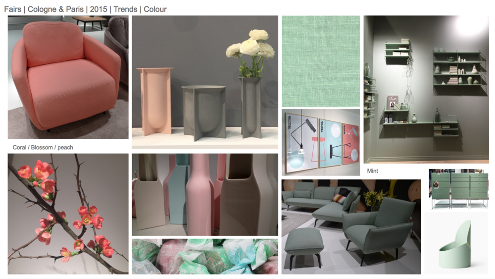
Dirty pastels and complimentary shades of peach and turquoise are still very prevalent. Slightly bolder hues now being used as accent colours.
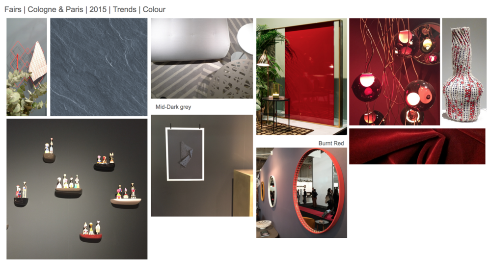
Where midnight blue and oxblood have previously been segregated to christmas; they now seem to be here for the full season! With contrasting neighbours of PINK/RED and NAVY/MUSTARD.
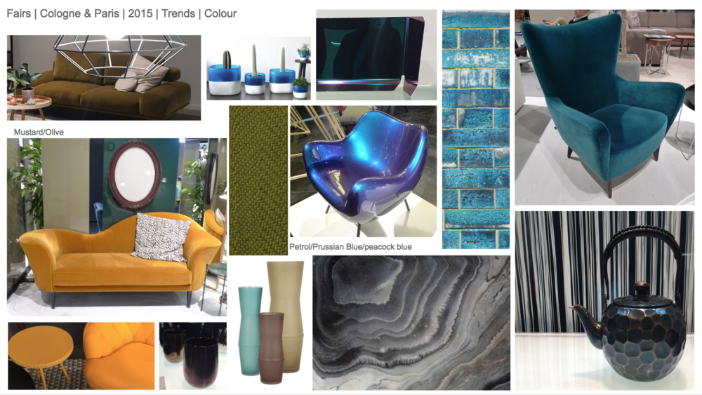
Petrol and peacock blue will stay right until AW15 and beyond, especially in velvets and metabolised finishes. The colour has been given texture and depth and can be easily refreshed for SS16.
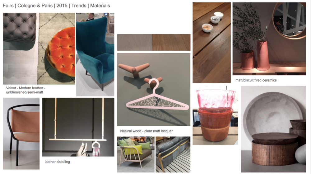
Lots of contrasting tactile textures displayed next to each other. Cold concrete with warm walnut. Luxurious bright velvet with soft matt mid tone leather. Shine powder coated metal rod and natural tan leather.
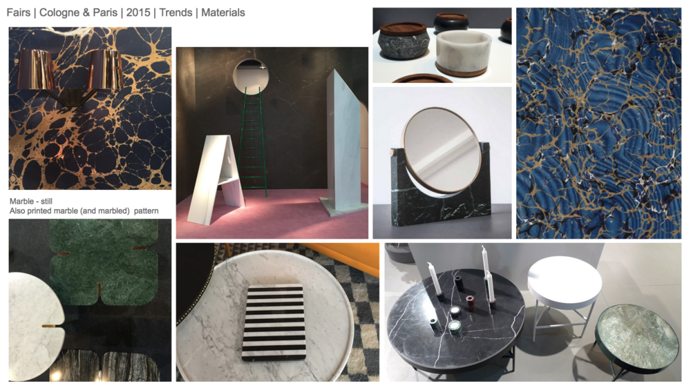
Marble is not going anywhere! Still plenty of tabletops and accessories. But no longer just black and white, deep greens are making their way though. Also marble effect, from marbled paper to digitally printed marble patterns, used on tabletops and walls.
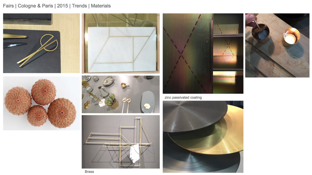
Lots of brass and copper, used in conjunction with ceramics, leather, cork and timber. More zinc passivated sheet and hot dipped galvanised finishes.
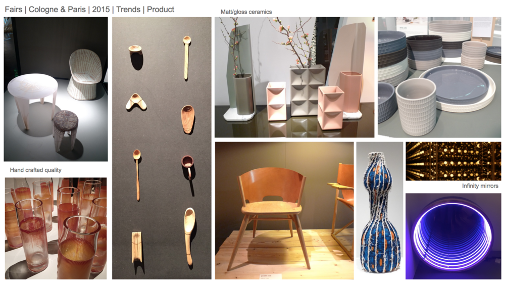
The hand crafted and 'perfect inperfections' still a main draw to visitors; some elements could be used commercially.
Architectural inspired ceramics & strangely I noticed allot of infinity mirrors.
It was interesting to see the core colours remaining, but some evolution to application and execution. Plenty of elements to take on to SS16/AW16.